Too Many Requests from Your Network
Please complete verification to access this content.
Visual content is eating the web.
From 2011 to 2015, the average time spent watching digital video daily increased from just 21 minutes to 1 hour, 16 minutes – an increase of 261%.
Visual-centric social networks – Snapchat and Instagram – have seen massive growth within the same period. Instagram now has over 400 million users, while Snapchat’s active user count has topped 200 million.
Altogether, we upload over 1.8 billion photos online every day.
Unsurprisingly, all this visual content also brings with it a lot of opportunities to capture more traffic and turn more visitors into buyers.
Why Visual Content Matters
Your audience doesn’t have time to read anymore. From social media to smartphones, they have to battle a thousand distractions every single day. If it comes to choosing between a long-form article and short video, most consumers would choose to watch the video.
We’ve actually known this for years. Back in 1997, Nielsen conducted extended eye-tracking studies and found that 79% of users scan content online, and only 16% read a page word-by-word.
Even while scanning pages, users tend to follow an ‘f-shape’ pattern and focus more on images than on text.
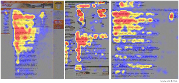
Here’s why:
- People are visual learners: Two separate studies of learning behavior found that after three days, a user retained only 10-20% of written or spoken information, but 65% of the visual information.
- The human brain process visuals faster: According to Visual Learning Alliance,visuals are processed 60,000X faster in the brain than text because of the 40 percent nerve fibers that are linked to the retina.
- People prefer images over text: An eye-tracking study by Nielsen found that most people prefer information-rich images over similarly dense text.
Further, visual content makes it easier to convey your brand’s values and principles rather than using plain text.
It really is a win-win situation.
Below, I’m going to show you 7 ways you can use visual content to increase your conversion rates:
1. Use visual content to create a “visual hierarchy” on your site
Every website has a hierarchy. This hierarchy dictates what your users focus on first.
More often than not, this follows a simple pattern:
- Users focus on images before text.
- The larger an element (image or text), the more attention it attracts
- Colorful elements attract more attention than others
- Images of people draw more attention than generic images.
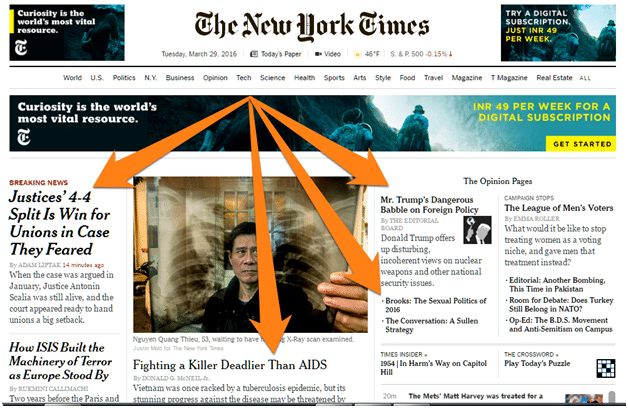
As it turns out, you can use visual content to create a better sense of hierarchy on your site and guide users to the most important elements on any page.
For example, on the New York Times website, the most important news stories either have larger font size or are accompanied by a picture.
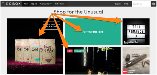
Firebox.com, on the other hand, uses images of different size as well as colored blocks to draw attention to specific elements.
How to apply this to your business:
- Figure out the most important elements on your site (a CTA, an offer, etc.)
- Use pictures, colors and larger fonts to emphasize these elements.
- Typically, the larger and more colorful an element, the more attention it will draw.
2. Use visual content to convey emotions
Human beings are naturally empathetic; our ‘mirror neurons’ reflect and copy the emotional state of what we see.
You must have experienced this yourself: seeing a picture of a happy person puts a smile on your face. A sad image, on the other hand, can ruin your mood immediately.
Marketers can use this fact to their advantage by using visual content to convey the emotions they want their customers to feel.
For example, InadaUSA.com sells massage chairs. These chairs help users relieve stress and relax. To emphasize this, Inada uses images of people experiencing utmost bliss sitting in their chairs.

When you see such an image, your subconscious mind starts feeling a bit relaxed as well.
Another great example is ZenDesk.com, a Saas company that sells helpdesk software. Their homepage shows a video of a scuba diver (an aquanaut) and an astronaut.

Their tagline – “Businesses are Made of Relationships” – points out the importance of bringing people from different backgrounds together (just like the astronaut and the deep sea diver). As you linger on the page, the astronaut and the aquanaut turn slowly towards each other.
Later, to emphasize the importance of building relationships in business, ZenDesk uses an image of the aquanaut and the astronaut having a cup of coffee together.

Not only is the image startling (and funny), it also perfectly captures the purpose of ZenDesk with a visual metaphor.
How to apply this to your business
- Identify the key emotions you want your customers to feel (such as joy, excitement, peace, etc.)
- Find images that convey these emotions and use them in all your marketing.
3. Use images to show that there are real people behind your business
Human beings are hard-wired to respond to faces.
According to a seminal study in 2005 by researchers at Caltech, there are certain areas in the brain dedicated to responding to faces. These areas fire up only when shown faces of specific people.
For example, the study showed that in one patient, a neuron fired up only when the patient was shown a picture of Jennifer Aniston (researchers called this the “Jennifer Aniston cell”).
Another study of user behavior across cultures found that images with facial characteristics are more positively received by users than images with no human images at all.
Eye-tracking studies by Nielsen drew similar conclusions. Web surfers focused on human photos instead of text on most websites.
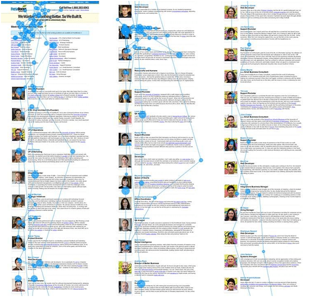
This helps users associate the website with real, specific people.
You can use this fact to your advantage by using images of people to increase conversion rates.
For example, Medalia Art, a website that sells Brazilian and Caribbean art, increased conversion rate by 95% by showing the artist’s image along with their artwork:

Wistia.com, on the other hand, has a separate page for its team members with a yearbook-style layout:

This is a great way to humanize your business and increase your trustworthiness. The more people trust your brand and know that there are actual humans behind it, the better your conversion rates.
How to apply this to your business
- Take pictures of all your team members and use them on your About page, blog post bylines, etc.
- Avoid generic stock images at all costs.
4. Use images to highlight your product’s quality and craftsmanship
For some products, simply describing the product’s key qualities isn’t enough. You also need to go into the specific details that make the product special.
This is particularly true for high-end artisanal products where customers are paying for the quality of the craftsmanship and materials used.
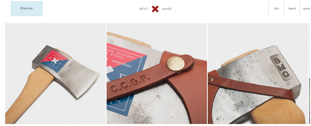
For example, bestmadeco.com, uses highly detailed images to show off its product’s quality construction and manufacturing process.
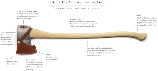
It includes large, high-quality pictures of each product’s special features, showing users exactly what makes the product so special.
SaddlebackLeather showcases its product’s durability and ruggedness by including a massive gallery of ‘action shots’ of the product submitted by actual users.

All of these shots are in exotic locations, which also helps to associate the brand with outgoing, adventurous people – a big branding win.
How to apply this to your business
- Take highly detailed images of all the features that make your product special.
- Take your products out of the studio and show off how they actually look and work in real life.
5. Use Slideshare presentations to illustrate your ideas visually
Slideshare is often called ‘YouTube for Powerpoint’. When you need to show, not tell, creating a Slideshare presentation is the way to go. This is particularly true for explaining hard-to-grasp concepts or ideas.
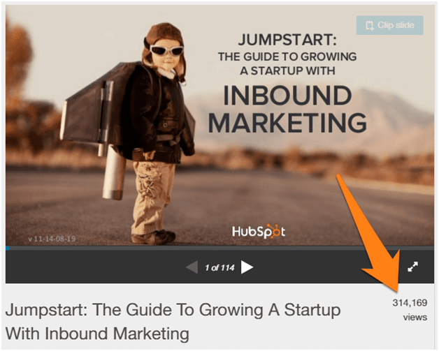
For example, when Dharmesh Shah and Brian Halligan wanted to explain the idea behind inbound marketing, they created an in-depth Slideshare presentation to go along with their book.
This presentation has since been viewed over 300,000 times and has been the go-to source for people new to the field of inbound marketing.
When Upworthy wanted to explain the magic behind its phenomenal growth, it turned to Slideshare as well.
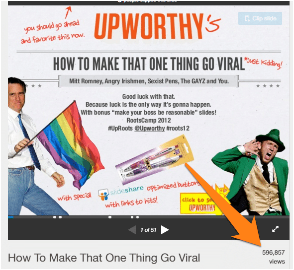
This presentation has over 600,000 views.
Creating Slideshare presentations offers three benefits:
- Improves the clarity of your marketing message and helps customers & employees understand your business better.
- Attracts additional traffic from Slideshare as well as search.
- Helps you convert viewers into leads with Slideshare lead-capture tools.
The best part? You can embed these presentations into your existing blog posts. You can also repurpose existing content to create these presentations.
How to apply this to your business
- Condense your entire business idea into a series of images. Think of this as a ‘visual business plan’.
- Turn these images into PowerPoint presentations, then upload them to Slideshare.
- Embed the Slideshare into your content, or add a ‘content gate’ to capture leads from the presentation.
6. Use videos to show off your products
Your customers love watching videos. Not only do they spend hours on YouTube and Netflix every day, they even trust videos when making purchase decisions.
According to one study, 73% of customers are more likely to buy a product after watching a product video.
There are multiple ways you can use videos to improve conversion rates on your website. Some of these are:
1. Explain product features
A video gives users a clear picture of what to expect from the product. You can create videos that show off how the product works, its key features, and what makes it special.
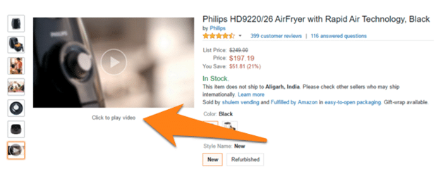
For example, Amazon uses videos for most of its bestselling products:
2. Show off how a product actually looks
Sometimes, a picture can’t do justice to your product.
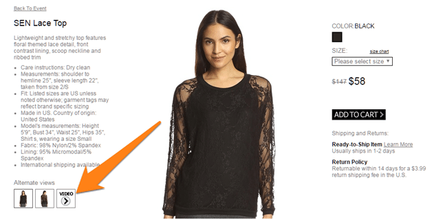
This is particularly true for apparel where how a piece of clothing fits is hard to show in a static image. A short video showing off the product on a model can give customers a much better idea of what to expect.
Here’s a great example from MyHabit (also owned by Amazon). When the user hovers over the ‘video’ button, the video starts playing automatically, giving customers a detailed look at the product.
3. Explain how to get more out of a product
Want to attract new customers while also keeping new customers happy?
Simple: show off everything your product can do, and how to get more out of it.
Weber, for example, regularly creates videos with grilling and maintenance tips to help customers make better use of their grills.

Similarly, REI, which sells outdoor equipment, creates tons of expert videos showing customers ways to get more out of their purchases.

How to apply this to your business
- If your product is difficult to understand, create a video to explain how it works.
- Create a video that shows customers how to better use your product.
- Create videos that show off the product in action.
Related post: 5 Reasons to Include Video Content in Your Strategy
7. Use animated GIFs to capture user attention
Last year, a journalist reached out to Google to know more about their YouTube live streaming plans. This was the official Google response – a single GIF:

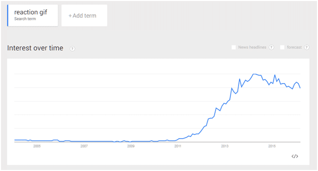
Gifs use has skyrocketed in the last few years thanks to sites like Buzzfeed. The Google Trends report for “Reaction GIFs” is quite illustrative:
The question now is: how can you use GIFs to attract traffic and increase customers?
Here are a few tactics:
1. Use GIFs to stand out in a crowded space
Your customers are bombarded with email. Standing out in the inbox is harder than ever before, even with image-rich HTML emails.
GIFs, however, are still scarcely used in emails, which makes them great for capturing attention.
For example, Jack Spade sent this gif in an email to show users how they can use clothing layers:
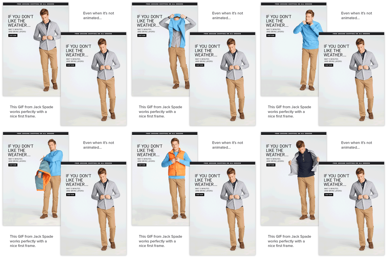
Not only does this GIF capture attention, it also visually demonstrates Jack Spade’s marketing message.
2. Use GIFs on social media
GIFs autoplay in Facebook, Twitter and Google+ feeds. Unlike videos, they also load quickly. This means that if you use them in your social media updates, they’ll likely capture more attention than static images or videos.
Here’s how Verizon uses GIFs on Google+ to capture user attention:

3. Use GIFs to show off products
GIFs can be a great way to show off your products without investing in an expensive video.
For example, Dogfish’s Head uses GIFs to show off how its products are made:

Since these are often the only moving elements on a website, they immediately draw the reader’s attention.
How to apply this to your business
- Make GIFs of your product in action, share them on social media as well as your web store.
- Use GIFs in CTAs, social media, and banner ads.
- Use ‘reaction GIFs’ to emphasize an emotion in a blog post.
Over to You
Visual content is going to become an even more important part of the web in the coming few years. Not only is visual content easy to consume, it can also help you attract new customers and improve conversion rates.
By following the tips above, you can create visual content that shows off your products, emphasize special features and make your customers feel specific emotions. High-quality visual content will also help you expand your reach on new platforms (such as YouTube and Slideshare) while improving your brand image.
Khalid Saleh is the CEO and cofounder of Invesp Consulting, a leading provider of conversion optimization software and services. Invesp’s Pii powerful A/B testing engine allows users to test unlimited variations of a landing page and offers them a quick turnaround on ROI.

