We heard you wanted improved performance, better features, and fewer bugs.
So, over the past couple of months, we worked hard to deliver exactly that.
Now, each year, improvements to the app have been accompanied by a pricing increase.
But this year, we decided to make only a modest increase to our Blogger Plan from $49 to $69, effective May 17, 2017, for new users ONLY, so that we can continue bringing you these needed upgrades, faster, at an affordable price.
Again, the updated pricing is only for new users.
So, if you’re already signed up, then you can continue giving us feedback and enjoying the tool at your current price point.
What’s In It For You?
We have always taken pride in our transparency as a company; so, when we do these pricing adjustments, we want to show you your money’s worth.
Below are some of the new features that you can expect soon.
New NinjaOutreach Features 2017
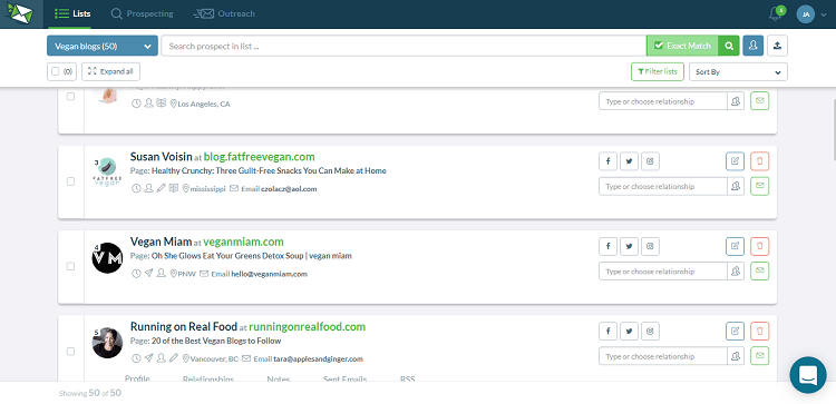
- Redesigned Prospect Cards
We’ve heavily redesigned our prospect cards, and here’s what changed:- If you hover over the card, you can see more information like Profile, Relationships, Sent Emails, and RSS.
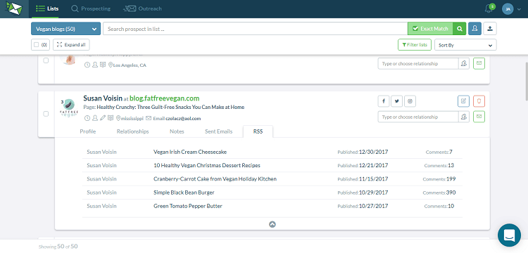 This cleans up the interface while significantly reducing the number of clicks you need to make.
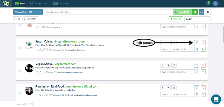
 - You can view and edit your prospect’s information much faster with the now more accessible Edit button.
- The search bar for Relationships now features predictive search in the drop-down menu. As you know, we have a set of premade Relationships labels that you can take to manage your prospects.But due to the volume of these labels, it can sometimes be hard to search for and choose one. Now you can start typing directly into the Relationship box like so, and our app will show the closest options. If you find nothing that applies to your project, you can create a new Relationship label by simply typing into the same Relationship bar like so.
- You can now use the shortcut CTRL/SHIFT + Click to easily select prospects. You can select the entire prospect card (doing so turns the whole card blue) and still do other tasks without the card getting deselected.
- If you hover over the card, you can see more information like Profile, Relationships, Sent Emails, and RSS.
- Server Side Filtering
- Our search tool can now display ALL the results of a single keyword search instead of just 5k.
- For example: Previously, if you made a search and got 2k results, then apply some filters (location, the number of followers, etc) to those, you end up with significantly fewer results.
- Why? This is because our tool would have filtered ONLY from those 2k results it generated.
- So, here’s what we did: we implemented continuous pagination (similar to Google search results display) so you’ll get more comprehensive results from your keyword even after applying a filter.
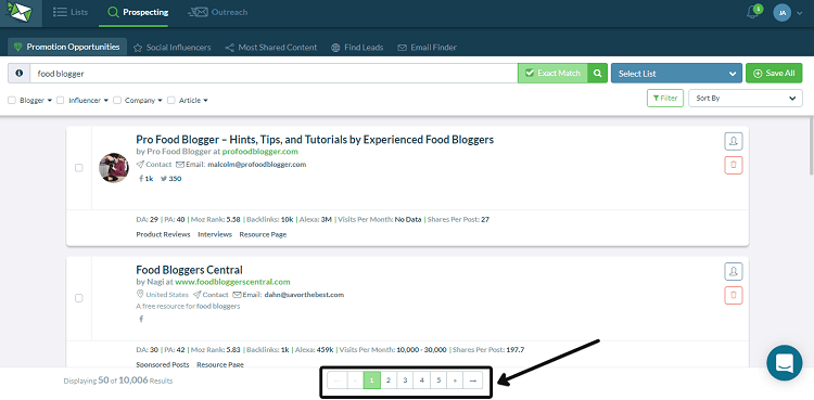
- If you search for “marketing” now, you will get over 8k pages with 20 results on each page – that’s about 80k in total!
- Reactivated Email Notifications
- We reactivated email notifications to let you know when prospects have replied. You can easily turn this feature on/off in the Settings page.
- Pulling Message History from Contact Forms
- In the past, any emails going to and from contact forms get lost.
- But now, you can track emails you send via Contact Forms.
- Let’s say you have a prospect that you can only connect with via a contact form. Turning this new feature on will add a reference ID, visible to the recipient (your prospect), at the end of the email template.
- Once you receive a reply, the app will instantly match that to the correct prospect based on the reference ID, thus allowing you to track email history easily.
- Redesigned List Management
- You will notice a few subtle changes to our List Management.
- When hovered, the list card will change color and display info for the number of emails sent over the total number of emails in the campaign. It should look like this.
- We repositioned the Create a List button from the end to now appear at the start of the list for more intuitive movement around the app.
- You can now reorder individual lists according to your preference.
- Fixed and Reduced Bugs
- We work hard day and night to maintain a smooth-running app and in April, we reported 50% fewer bugs compared to the previous 3 months.
- Our goal is to report 66% fewer bugs by June.
New Upcoming Features
We are also working on adding these exciting new features:
- Redesigned Autosending Experience
Some updates:- We’ve simplified our autosending board to only display the information you need at a glance such as a campaign name and campaign status. No more TMI!
- You can now see all the steps in the autosending feature to give you better control over the entire process. Previously, the process was largely hidden, feeding you each step one-by-one.
- We also added a Check Prospects pop-up to allow you to include/exclude prospects with missing fields, unverified or bounced emails, and prospects emailed in past campaigns.
- Soon, we will also roll out improved segmentation, where you can customize your email campaigns by using more specific placeholders. For example, you can set up something where you can choose to send only to prospects in, say, “List #1”, with the tags “Influencer”, and set a status of “Blogger agreed to share”.
- You can enable/disable the email verifications feature to avoid disrupting ongoing campaigns. Right now, our email verification feature stops campaigns (without notifying you first) when it detects unverified email addresses. We’re fixing this problem by automatically launching your campaign once the verification is done so you don’t have to worry about doing manual relaunches again.
- You can now rename your campaigns according to your preference.
- Segmented Content Prospecting
- We realized our current Content Prospecting tool is displaying too much information upfront, making it more confusing instead of helpful.
- We are working to improve the experience. Soon, we will launch more properly segmented searches that are focused on each user’s need.
- What we’re going to do is divide the search into four categories targeted to each particular case that you might need them for: (1) Finding the most shared content, (2) finding leads, (3) finding promotion opportunities, and (4) finding influencers.
- The search results, options, and the information on the cards will vary depending on which case you choose. So instead of showing you ALL the info ALL the time, we’ll show you only the results that correspond to your specific use case.
- For example, if you are looking for “most shared content”, you will receive search results related to most shared topics, most shared websites, etc.
- Likewise, if you’re looking for promotion opportunities, you will receive search results related to guest posting or product reviews, and so on.
We Want to Make Your Life Easier
So there you have it! We hope these new features will help you create more successful campaigns and we are always happy to improve our app to serve you better.
If you still have any questions about these updates, don’t hesitate to drop us a message via our Live Chat!

