Are you thinking of re-branding your site? Are you looking for a web designer who will work on your site’s layout?
Over the years, websites have gone from plain HTML to responsive web design.
And over the course of those years, website owners joined the trend, changing their web design to and fro ⎯ whatever is appealing for their site.
Fast Track from the 90s Until Now
We owe much of the success in web design during the birth of CSS; finally, web designers have more power than ever to separate content from design without compromising quality.
We saw the advent of GIFs used in displaying information or simply to catch the attention, then came in Flash and all the elementary looking animations we saw (and amazed us).
Then came aesthetics. We started valuing how good our website looks through typography and clean designs.
SEO then came in and web designers were forced to comply with search engines to provide and prioritize user experience.
Major web developments and designs kicked in due to mobile usage from phones and tablets ⎯ this is where we are now.
Theme This, Theme That
At the top of Google’s core principles is:
“Focus on the user and all else will follow.”
Google is one of the major search engines in the world; most of the people working in the world of web development and design understand that Google has been pushing this principle for years, thus the birth of innovative web designs. However, we have been too busy focusing on different matters:
- Are we satisfying the client’s wishes?
- Is this the most cost-effective design?
- Can we just do away with a free theme?
- Why not use a website builder to cheaply do a website instead?
- Oooh! Nice features. Nice buttons. I like pink.
- Is that responsive?
It Doesn’t Fit Right
How can you tell if your site’s web design simply isn’t the right theme for you?
User experience plays a big part in determining what’s wrong with your website.
In determining the negative elements that evaluate your web design, you have to consider how users view your website, instead of what you want to appear on your website.
You might want a flashy, spectacular website, but does that work out for your business?
Is that in line with what you want to project for your brand?
Are you prepared to test if the design is cut out for your business?
What can you do to check if your web design is good for you?
Get Technical: Use Google Analytics
If you have installed Google Analytics on your site, then you’re in luck!
A free Google Analytics account can help you observe and infer what certain parts of your site can be improved.
Google Analytics has features like Behavior Flow, Site Speed Suggestions, and Funnel Visualization; all of these can help determine faults on your design.
Below is an example of how you can use Google Analytics’ Behavior Flow:

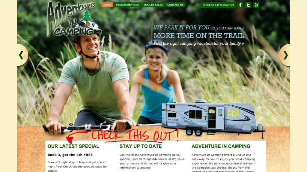
The image below is the home page of an RV trailer rental company in California.
As you can see, the content focused more on what you can do if you rent an RV trailer from this company.
There are opportunities to check out their Trailer Rentals, Sales, Reservations and Specials.

Looking at their Behavior Flow from Google Analytics, you can see that 22.5% of their traffic is lost upon entering the site.
What can be the cause? Let’s continue analyzing the site with Site Speed Suggestions.

Here are the top landing pages of this site. On an average, these landing pages load at 5.6 seconds.
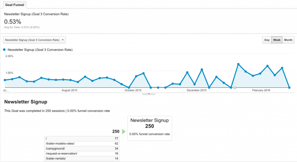
Let’s focus on a specific goal, “Newsletter Signups”.
They have accumulated at least 250 newsletter signups in a specific period, but there are only specific pages where this goal started and completed.

Our Takeaways
- Slow Loading Site: With a fast internet connection, everyone is expecting that a website will load faster. Google has recommended that site owners should at least aim for half a second to load the site. Most of the time, images are at fault as to why loading times are poor. Your options: either optimize images and elements in your website, or get a reliable web host or a content distribution network if you have a large site. The Site Speed Suggestions feature can help you determine what you need to improve on every page of your site.
- Poorly Designed Navigation Buttons: Navigation is important for users in going around a website. If they cannot find where and how to go to other pages within a site, they just exit the site and look for another website. Therefore, it contributes greatly to a site’s bounce rate. The sliders attract your attention, compelling you to scroll down. Scrolling down brings you to the Specials column, Newsletter Signup, and an introduction to what the site is about. There’s nothing much to look at, which helps us conclude that…

- Ambiguity: They can’t find what they’re looking for. The home page is aimed to direct the users’ attention towards sales with the navigation menu including links to sales and reservations. Doing a quick check on the site will yield you results on organic searches for “june lake camping” or “mammoth lake camping”. This means that people are looking for campgrounds; that’s a perfect opportunity to lure in sales, rather than forcing them to reserve or look at the rentals. Better landing pages equate to better conversions. Ask your web designer if you can focus more on the product or service than hard selling what you can offer.
- Call-To-Action: Conversions aren’t difficult to get and find. Looking at how they have converted a lot of traffic into signups isn’t bad, but it could have been improved if certain call-to-action points weren’t missing on pages you can drive traffic the most. One of the most visited pages in the site lack certain conversion points such as newsletter subscriptions, contact page call-to-action to attract inquiries, and more. Consult with your web designer on how to maximize your web page on subtly inserting call-to-actions to drive visitors to leads.

Get Visual: Use Heat Map Analytics and Peer Reviews

Thank heavens for the creation of Heat Map Analytics! Go in-depth with data on mouse clicks, hovers, and more.
These data can help you decide if your design is effective in creating interactions within the website.
You can specifically view mouse clicks on active and inactive parts of the website.
It gives off the signal that the user is expecting to be forwarded to another page once he clicks on a certain element in the site.
You can also check what call-to-action buttons are not gaining any love from your visitors.
In my experience, I have used three heatmaps and these are CrazyEgg, Clicktale, and Heat Map Pro by SumoMe.
Personally, I recommend Crazy Egg among the others because of its price and simplicity.
It takes a lot of practice to get used to its interface.
Although ClickTale has a wider range of features and tools, I’m not fond of the lack of precision in form analytics.
SumoMe offers free access to their tools for a limited time.
However, you get all that they offer; meaning activating the heatmap will also activate the other apps.
I also observed that as I clicked on the heatmap, it also counts my interactions towards the counter, something that shouldn’t be done by a heat map.
On the other hand, if you don’t have the budget or if you need immediate feedback on your web design, then go ahead and consult a friend or another person.
Another pair of eyes can help you check your web design.
Focus on how he navigates through your site; where he clicks, where he pays attention to, what makes him scroll down if he’s expecting a function that’s not yet available, and more.
Peer reviews are easier since you can conduct these easily with your coworkers or even your clients themselves.
Not all web designs are good for your site.
Some businesses will call for a simpler, minimalistic template; others can enjoy visually stunning web designs.
Nevertheless, it is the job of web designers to quickly judge if a design is appropriate for the brand; look past the high-resolution images and check if the site’s elements work the way it should be. That’s the time you can finally say that your design indeed is working for your website.
Author Bio:
Steve is a WordPress and design enthusiast. He loves to code websites, make them visually appealing, and improving their user experience. He contributes designs to Syrian Productions, a Philippines web design company.
